Your branding is a powerful statement. Your brand conveys a variety of messages (subtle or not so subtle) about your product or company. Think benefits, values, culture, and personality (to name a few). We want to make it easier for you to stay on brand so we’ve added some design enhancements this week to help you make a statement.
Default Email Template Themes
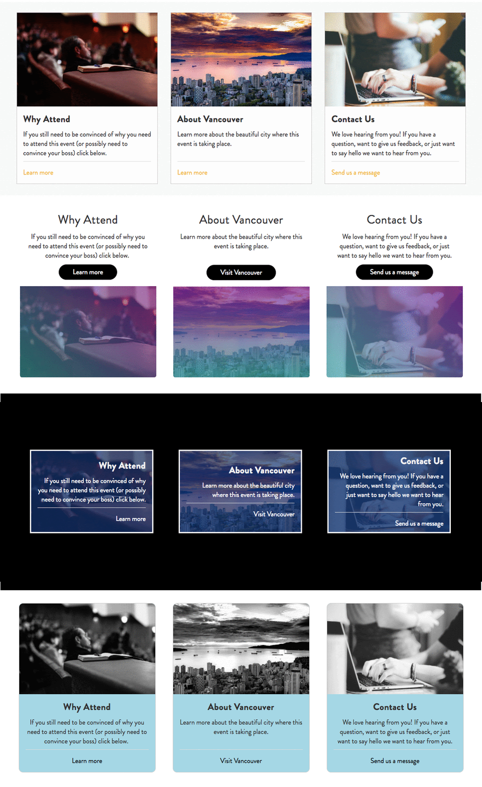
We offer a number of email templates which allow you to stay on brand while you communicate with your attendees. Configuring those templates, however, can take a bit of time. So when you need a great looking default email template fast, you can now simply choose from a light or dark theme (to contrast with your event logo) and it will look great right “out of the box”. This default template will now apply to all of your outgoing emails that you haven’t chosen an alternate template for.

-1.png)
Featured Content Block (for Mobile)
The Featured Content Block (the marquee or banner image with text overlay used on most event websites) is often the first thing a user will see when they arrive on your website. We have added two enhancements to make this block adapt better to different screen sizes.
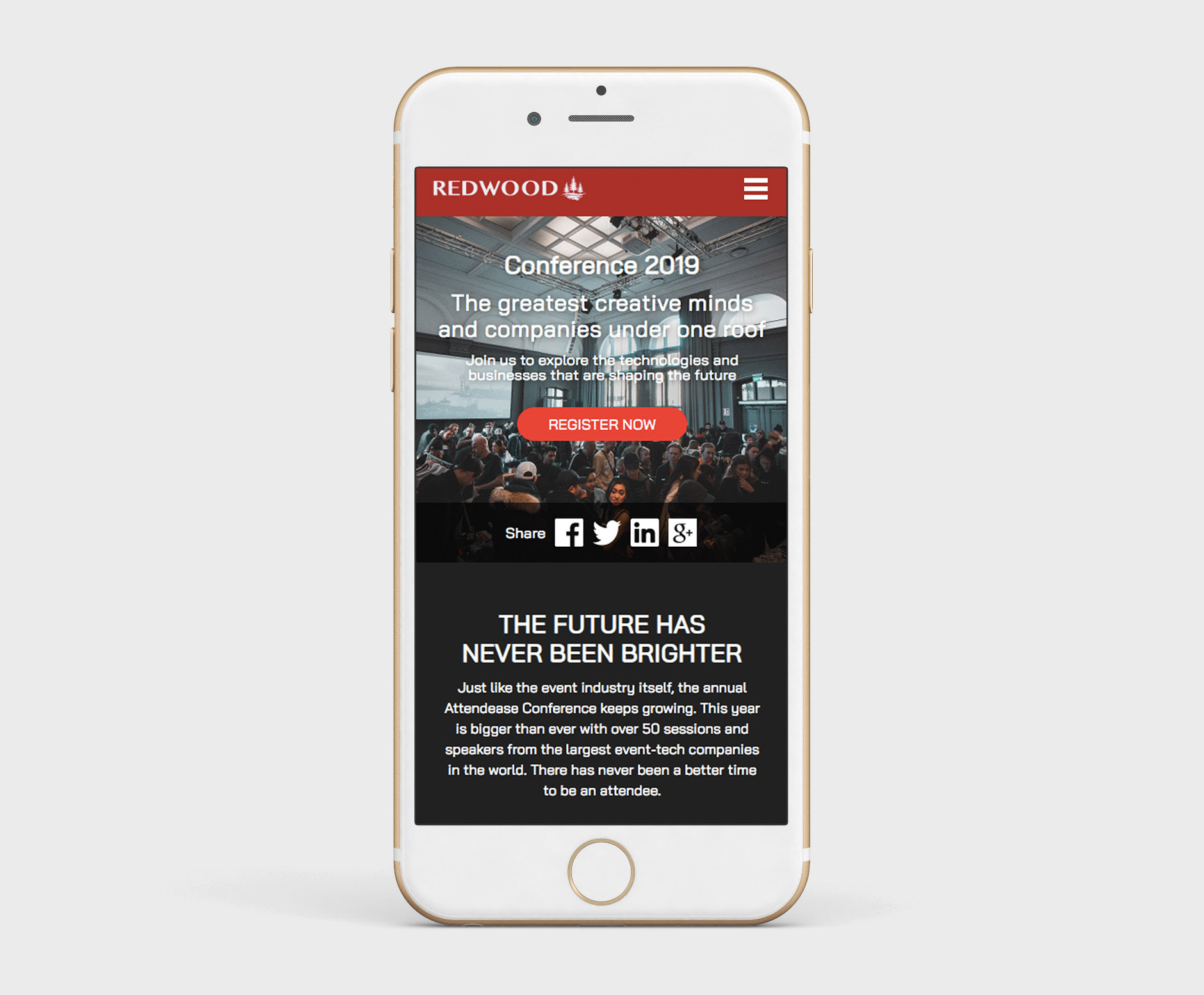
Add a mobile specific image
Now you can add a separate image that will only be displayed on screen widths associated with mobile devices (phones and most tablets). This gives you greater flexibility by allowing you to select the scale and crop of the mobile-specific image rather than relying on the platform to auto-crop and auto-scale it for you. In other words, if you use this feature the image will typically look better on phones and tablets!
Auto heading and text sizes on mobile devices
In the past, the heading and text sizes for the overlay were applied consistently to both desktop and mobile versions of the block. Due to the differences in screen size this could result in the heading and text sizes looking too big or too small depending on the device you were viewing them on. We have now implemented a mobile-only set of rules to control the heading and text sizes so these elements look great all the time.
New Accordion Block
We’ve added a brand new accordion block to the Attendease CMS that can be used on your event website and organization portal pages. This block is very useful when you want to toggle between hiding and showing a large amount of text like on an FAQ page, for instance.
-2.png)
New Form Builder Display Options
You now have access to some new options on your forms Display tab to make your Attendease registration forms even more beautiful. The new Spacer lets you add vertical space anywhere on your form, and the new Separator Line lets you place and customize horizontal lines between form fields or form sections.
.png)
Better Form Validation for Your Attendees
We’ve reduced the confusion for your attendees when they have missing or invalid data when trying to submit their registration forms. By adding some animations and style changes to the form in those cases, this aims to reduce attendee drop-off at one of the most crucial steps of the attendee lifecycle… Registration.
We hope these enhancements make your design related tasks faster, easier, and more efficient!

.png)
-1.png)

